
I played one to two hours of The Division a while back (around the time it was released) and these are my first impressions. Keep in mind that these impressions are things that I as a player will not have an issue with if I’ve learned the controls, that’s why I’m writing this now, because later I’ll just know the interface and not be as bothered.
(TBH I’m very cruel when it comes to first impressions. I thought ME1 was a cutscene interrupted by gameplay, that Destiny was an FPS with delusions of RPG, and I just didn’t get Dragon Age Origins until I met Alistair etc.) I’m playing on XBoxOne btw. I’ve gotten it for the PS4 as well, because everyone I know is playing it on PS4 and I think the experience may be different if you play together. I’ve not managed to level up that much so far, so that’s probably not going to happen. Also, I get side tracked by other games. All the time.
Consistency or lack thereof
First off, The Division UI is not very consistent. The A button and the X button frequently use the same functions but in different contexts (menus and in game) and it annoys me to no end. One of the things that do bother me a lot in UIs and not just The Division is that many games use A as a selection button in menus, but when it comes to gameplay, the X button or Y button is used to interact with things. From one perspective I can understand it. The A button is handy for things like getting in and out of cover, it’s easy to access for evading when in gameplay etc. At the same time, when I have the A button as a selection option in my menus and then have to change the way I think about interacting with something in world, it creates a disconnect between my muscle memory and what I need to do. It’s not a huge thing, but for me it IS a thing. It happens in Destiny as well, this disconnect between how the game acts in game and in menu. Pet peeve. Keep it consistent if you can.
Crowded HUD
One of the biggest issues I have with The Division is the very busy HUD UI. Things happen all the time and my attention is called for constantly. Not only does this make the HUD harder to read, it also makes me as a player exhausted. I have to keep changing focus from one end to the other and there are always prompts and notifications that want my attention.
The cover prompts in game take away the ability to notice button prompts that are not very prominent (because you can take cover everywhere, so the A prompt shows up… everywhere. All the time.). B and X prompts are hidden in the noise and X prompts mean there’s loot, so it’s not a good idea to hide that. I know I will be missing things, again because of the noise.
Also I spent a lot of time taking cover when I was looting because as I pointed out earlier, my muscle memory keeps telling me to use A to interact with things. I also spent time trying to interact with ladders and edges by pressing X, which was not the correct button. That’s B. Normally when I use B I use it to exit interactions, not to initiate them. This is another break with console consistency. It gives me the same feeling as switching between western consoles (Playstation and Xbox) and Japanese consoles (the Wii series). It takes a long time to reset my hands to be able to use it, because almost no other games do.
At the same time, Y is used for changing guns but not for reloading. That’s on X which is the interact button. Normally, I would have expected reloading and changing guns to be on the same button but with a different button press, again because of consistency.
In general, I would have given this controls setup a once over, or maybe even twice over before shipping it.
The Menu
Which brings me to the menu, where A is used for confirmations. Since X is used in game to interact, I pressed X constantly in the menu, because I expected it to be “confirm”. It was not. With the result that I was not doing what I wanted in the menus. This is primarily an annoyance that will go away after more hours of play, but right now it has me confused.
One could argue that using different buttons in game and in menu would be ok, because they are different game modes. I would agree, but both the menu and the game is really, really busy when it comes to the UI. It is a complex set of screens that I find tricky to navigate, and not very intuitive. If the screens had been less crowded, I think I would have been better able to distinguish the information that I needed and make fewer errors.
Also “B” is used for confirming actions by exiting menus, which I think is not such a good idea. B always mean cancel and exit or exit in my world. Again this is what many games have taught me over the years I’ve spent playing.
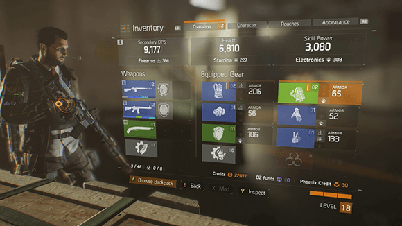
The backpack icons are also confusing, because apparently a backpack is armor. I had no idea. I thought it was a bag. I looked for it in the pouches, but apparently not, no it was in armor. This has more to do with expected affordances than anything else. What do you expect to do with a backpack? Put things in it or use it as body armor? Since the UI is so busy, trying to find things in the menu is hard, and that includes the backpack.
I don’t understand the weapons, at least not yet. I did like the little arrow icon that tells you if you have a better thing in your backpack and how to equip it. I didn’t get the mod thing, that may come later as well. In general, I wasn’t that fond of the way they had organized things in the in-game menu. I had a hard time finding things. I also have no idea where I can find information about the quests, but I’m assuming that’s on the map. Speaking of the map…
There’s no challenge to navigating the world, just follow the yellow line. The GPS can be turned off, which is one of the first things I did when starting to play. I’ve spoken to others who find the map really challenging to navigate though, so this is probably just me being an outlier when it comes to the map.
The combat is okay but the covers are confusing and the gameplay around covers is tricky to navigate. Sometimes the game pushes me out and kills me because it acts differently than I expected.
Although, again, the bad guys are too obvious, the UI is all over. I also had a hard time reading my weapons overlay. Since it was on screen all the time, bouncing along with me, I didn’t keep as close an eye on it as I should have, meaning I ran out of ammo and had to reload at inopportune times. Because there was so much happening on screen all the time, I basically tuned out most of it just to be able to concentrate on what I thought was important, which led to small mistakes and a general hampering of my skills as a player, because I couldn’t read the situation right. Very annoying. But at least they clearly telegraph what’s happening by having red markers showing up through objects, making the need to actually keep an eye on the battlefield kinda pointless. Just aim at the red markers.
The character generator was also cumbersome and unwieldy, but I’ll have to analyse that closer later.
Conclusion
In general – there’s too much UI. It’s everywhere, meaning that the things that are actually important like loot and traversal of the environment get lost in the overall noise. You can practically take cover everywhere, so why is the A prompt needed? The mission marker is good, but why have a line that makes you just follow the line instead of trying to find your own way? Everything has a prompt. I also dislike the hold button action that games are using more and more (including Mad Max. I didn’t like it there either, btw), in particular in safe areas where the timer brings nothing to the interaction except a waiting period. I also thought the timer was unclear and not very apparent. The first few times I barely saw it and didn’t understand why the interaction didn’t happen.
Many of the issues I have with The Division UI are a result of not playing more than a few hours. Most of these annoyances will go away if I invest time in them, and some of them may not even be problems to other players. But one thing I do want to point out is that the busier the HUD is, the less attention the player will pay to signals that they discount as unimportant. A contextual UI where you don’t constantly see the cover prompts would probably have been more successful in letting me as a player know what other opportunities there are in the world. A more consistent UI would teach me as a player how the UI is expected to react, and I wouldn’t have to pay attention all the time. As it stands, The Division craves my undivided attention, all the time, and it makes me really tired.
Since I played on pc the controller issues didn’t annoy me in the same way. Mostly everything with the UI was to my liking as long as you were going somewhere.
BUT! A huge one at that. Controlling the inventory menues are a pain. I didn’t have any issues finding what I wanted, but doing what I wanted wasn’t quite as easy. I had played for over 30h when I managed to accidentally salvage one of the best sniper rifles in the game… This happened because while salvaging trash I had switched to my weapons inventory. This means that the weapon on top is automatically marked, not as junk though, just marked. For some reason the junk salvage function salvaged this weapon as well, which happens to be the strongest weapon in your inventory >_<
I like the game, I like the cover system but that inventory is a mess to manage properly.